Client
Nexar
Product Design
Creating digital brand guidelines to complement a new visual identity

Project
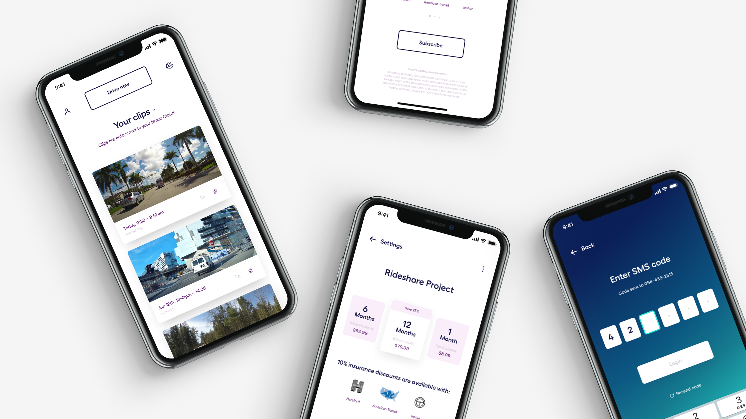
Nexar is a tech start-up that have created an integrated dashcam service and product. Whilst working with the team at Koto, I helped to translate a new visual identity into initial product screens and create a set of digital guidelines to facilitate the transition of the identity into their product and online services.
I also worked on creating a new, bespoke, brand guidelines site that helped introduce the new overall rebrand. The idea was to leverage the power of online and digital, in order to create a more efficient process for collaborators of Nexar, and move away from traditional PDF guidelines.
←
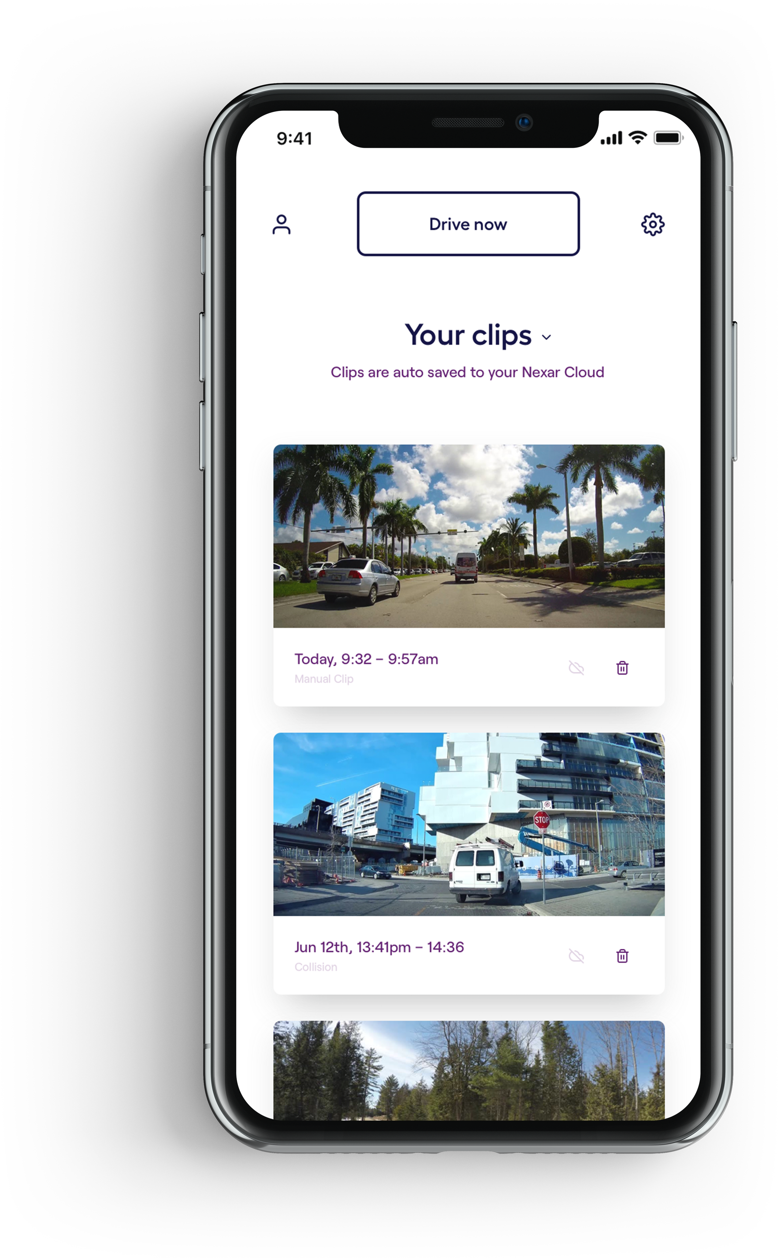
Once the visual identity had been set, I came in to help translate the branding into Nexar's product. The new rebrand consists of bold, dynamic, gradients with clean functional typography.
It was important for Nexar to have their product still feel functional and intuitive, as it's an interface that would be primarily used whilst within in a car and on the move.
By distilling the new visual identity into it's most functional states, I was able to build a set of guidelines to work uniquely within Nexar's digital product, whilst still retaining the mood and principles of the new rebrand.
↑
The concept for our submission began when Robin Barnes (Stink Studios' 3D wondergenius) discovered an extensive, open-source, library of V&A sculptures that we were able to be customize and alter freely.
We wanted to explore a concept where these scupltured could 'leave' the static exhibition space and be brought to life in a virtual and free environment - an environment where users could remix and customize the priceless scupltures standing infront of them in contemporary and thought provoking way.
↑
Once the visual identity had been set, I came in to help translate the branding into Nexar's product. The new rebrand consists of bold, dynamic, gradients with clean functional typography.
It was important for Nexar to have their product still feel functional and intuitive, as it's an interface that would be primarily used whilst within in a car and on the move.
By distilling the new visual identity into it's most functional states, I was able to build a set of guidelines to work uniquely within Nexar's digital product, whilst still retaining the mood and principles of the new rebrand.
↑
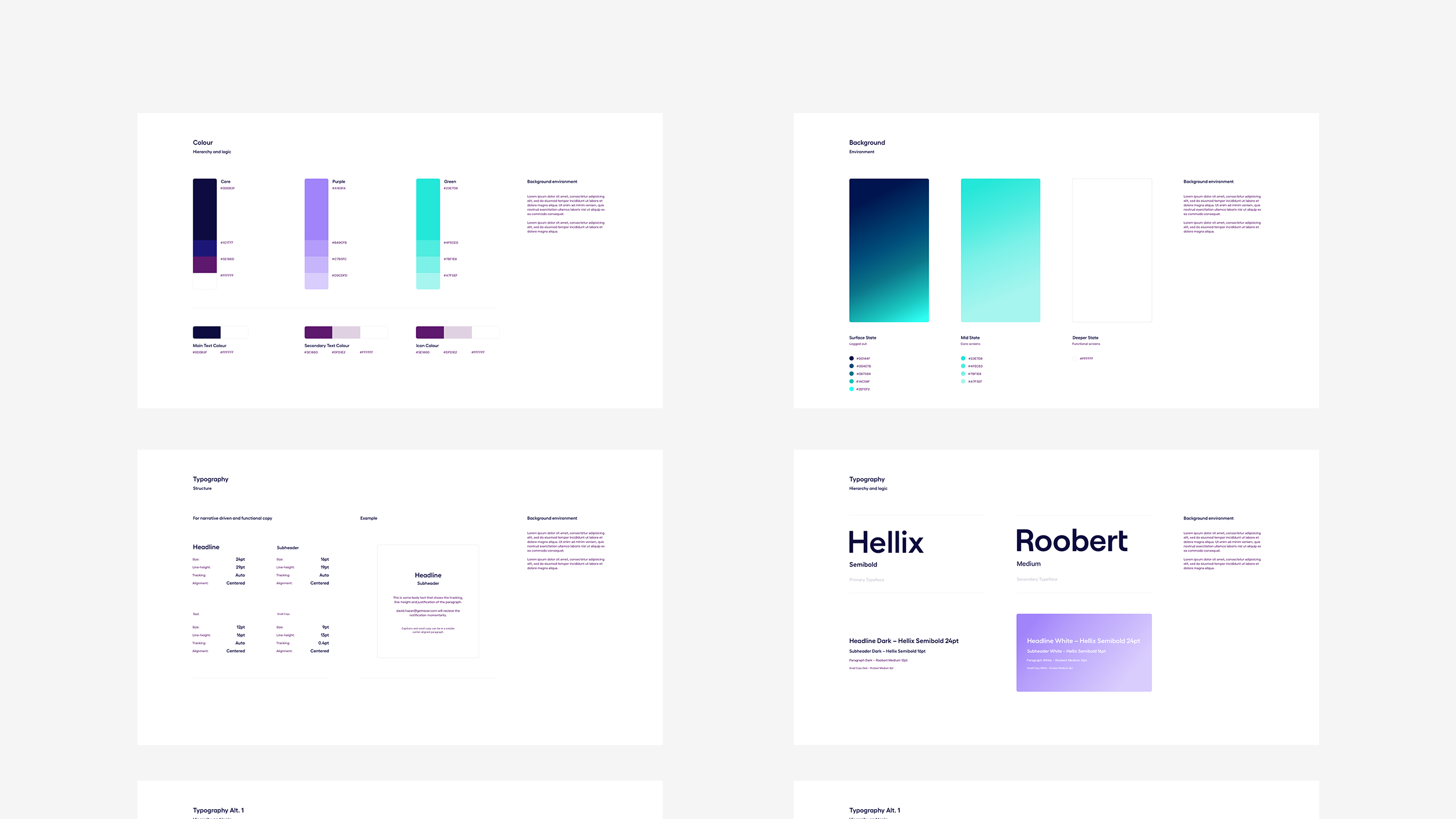
To facilitate the transition of the new rebrand into their product, I created a set of digital guidelines that detailed how Nexar can integrate their new identity moving forward. Living as an initial, internal, document it helped to shape how Nexar built up their new digital product.
↑
To facilitate the transition of the new rebrand into their product, I created a set of digital guidelines that detailed how Nexar can integrate their new identity moving forward. Living as an initial, internal, document it helped to shape how Nexar built up their new digital product.
↑
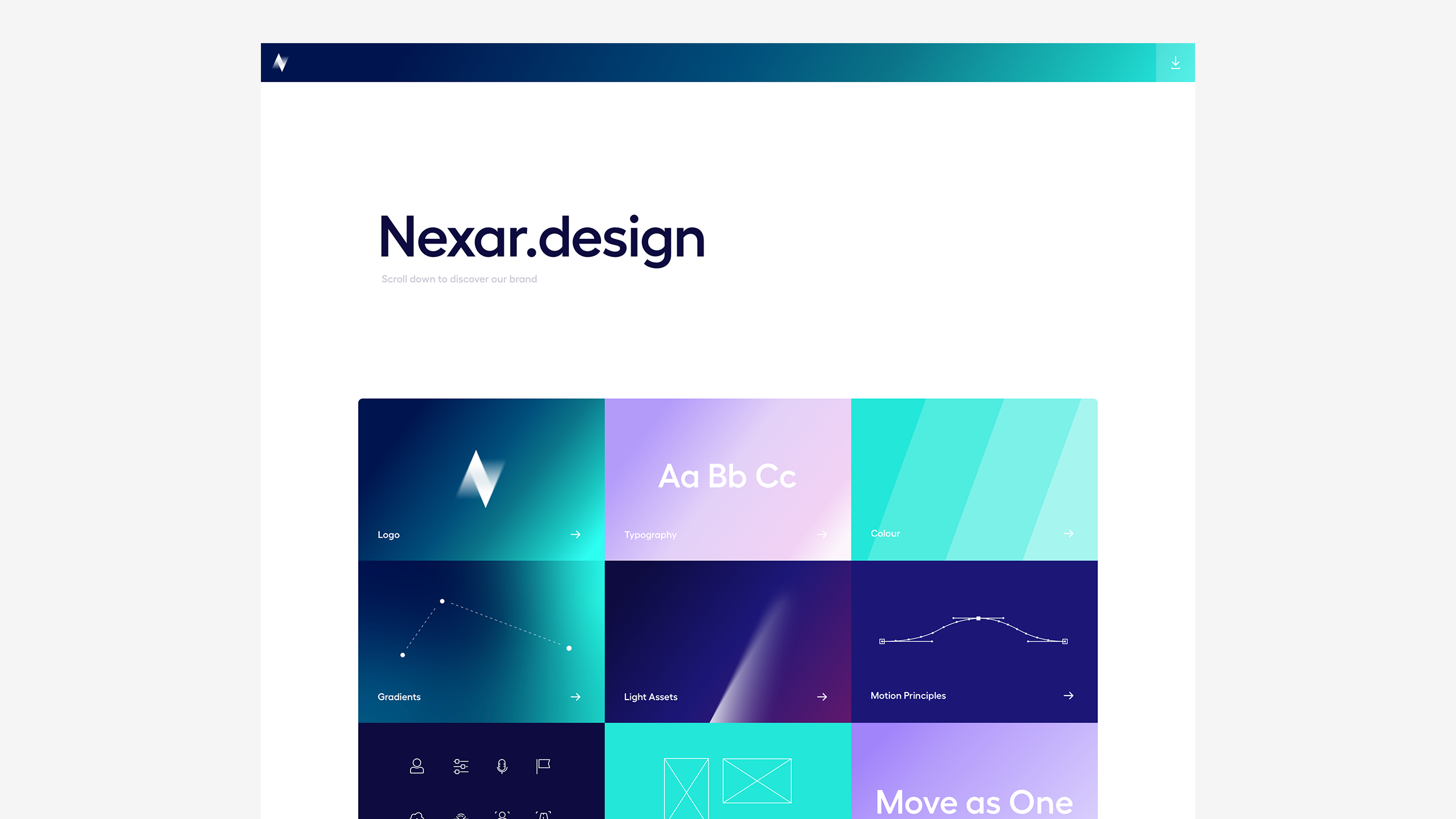
To coincide with the new rebrand, the team wanted to create a more bespoke approach to the brand guidelines and build an interactive site to showcase Nexar's new brand assets.
I worked on this from it's conceptual phase through to it's development and launch.
↑
To coincide with the new rebrand, the team wanted to create a more bespoke approach to the brand guidelines and build an interactive site to showcase Nexar's new brand assets.
I worked on this from it's conceptual phase through to it's development and launch.
↑
The team internally at Koto had already begun creating a PDF brand guidelines document when I was inititially introduced to the project - which made the brief simple: translate these static guidelines into a set of interactive guidelines.
After a period of research and concepting, we agreed on a creative approach and began refining how the each facet of the identity could be represented.
Due to time contraints, we landed on a modular route to make building and maintaining the site easy and flexible. Each module could then, in turn, be customized to tailor to each of the brand assets within the guidelines.
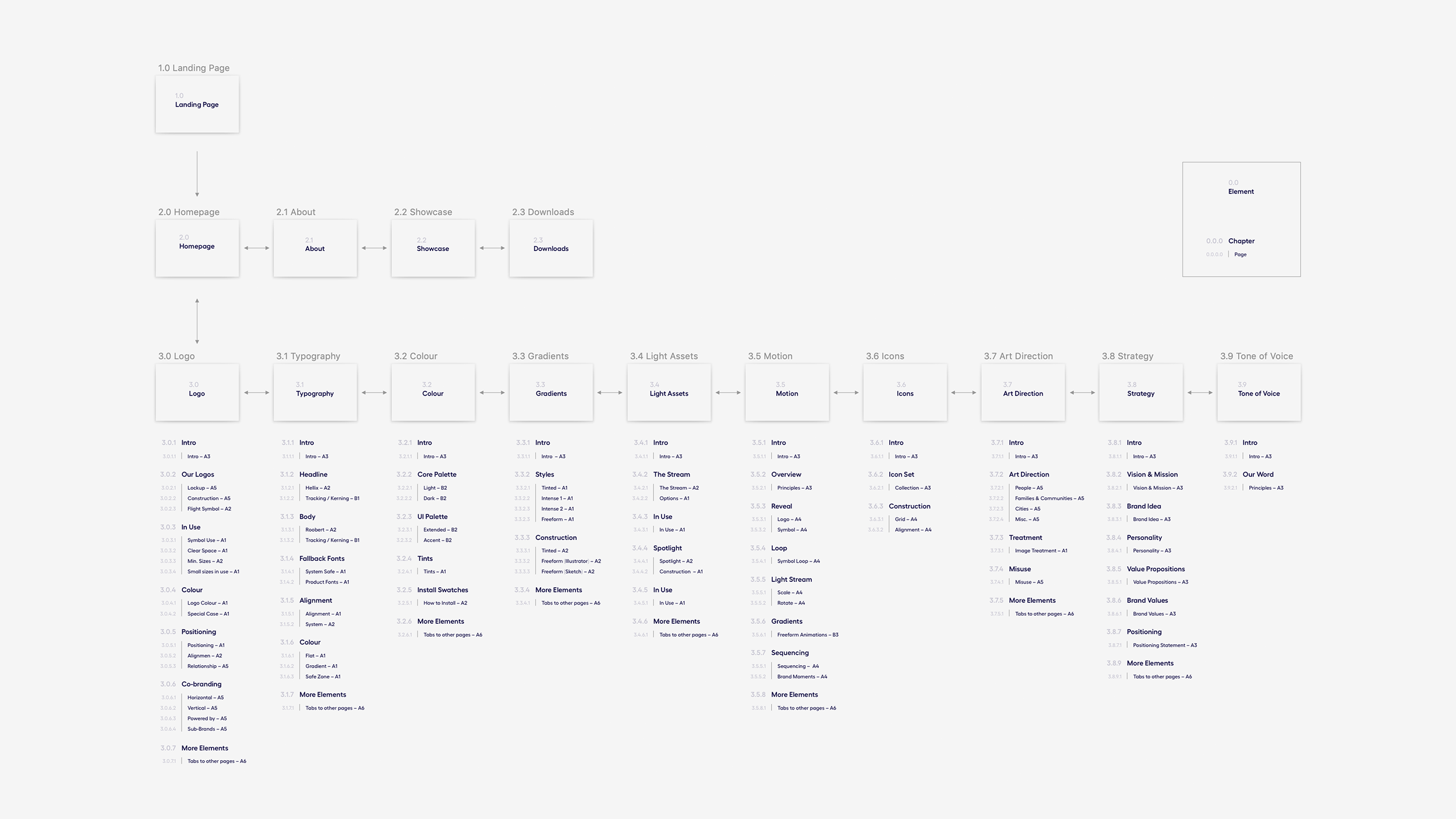
I then drew up the simple site experience into a Site Map to help communicate the architecture and hierarchy of the website, to help create and assign modules to each of the pages.
↑
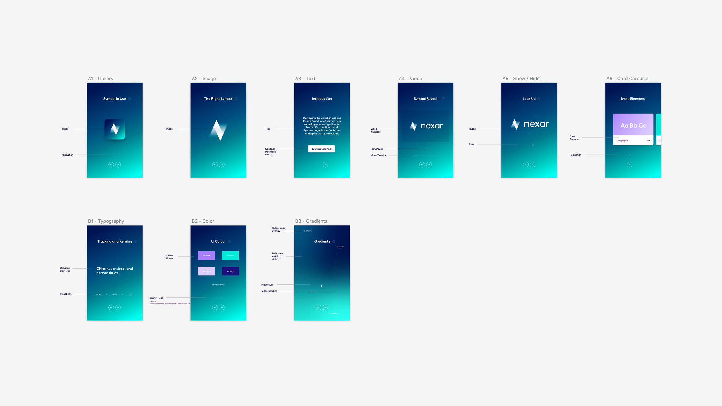
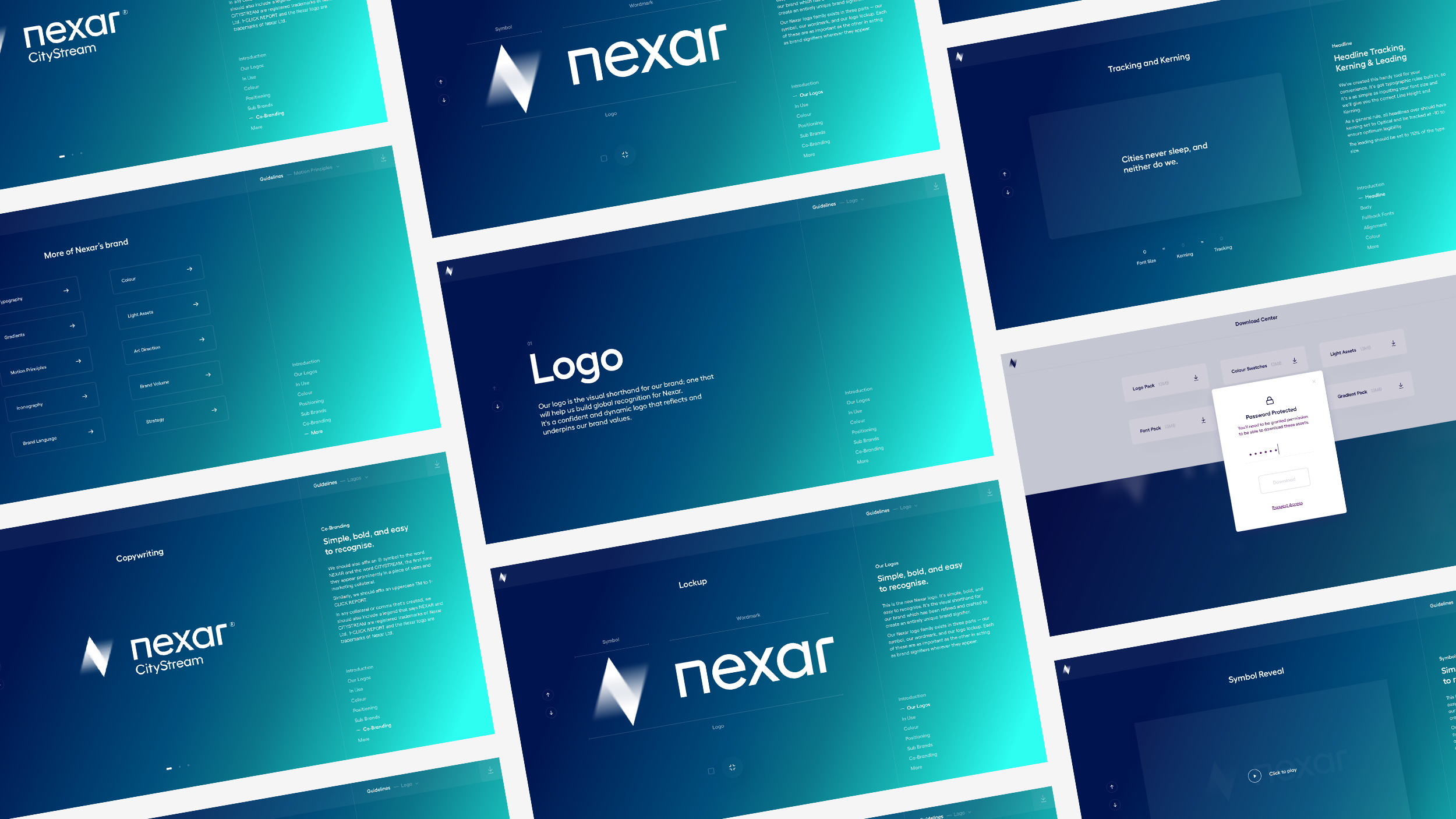
I began creating a series of reusable modules to represent and communicate the brand assets in new and interesting ways.
These were divided into 2 catergories - more generic modules, to be reused for repeat instances and content, and bespoke modules for instances where we could be smarter with how we show the brand assets.
As the project progressed, we continually refined the modules to better represent the guidelines and create a more efficient development process.
↑
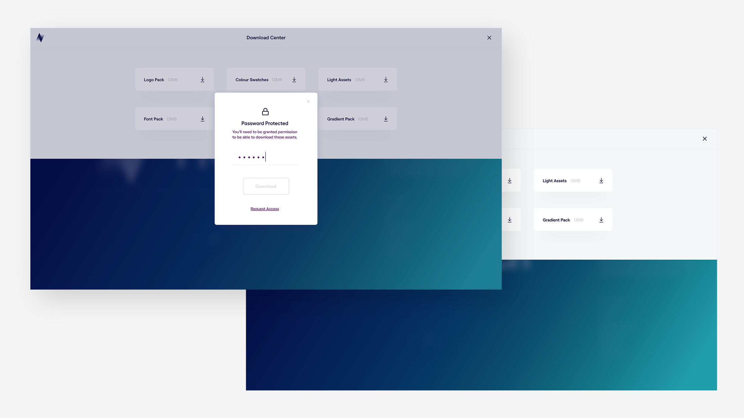
As well as being a tool to educate new collaborators with Nexar's brand, we also wanted it be a hub for their brand assets. At any point during the experience, users were one click away from downloadable brand assets and files.
↑
As well as being a tool to educate new collaborators with Nexar's brand, we also wanted it be a hub for their brand assets. At any point during the experience, users were one click away from downloadable brand assets and files.
↑
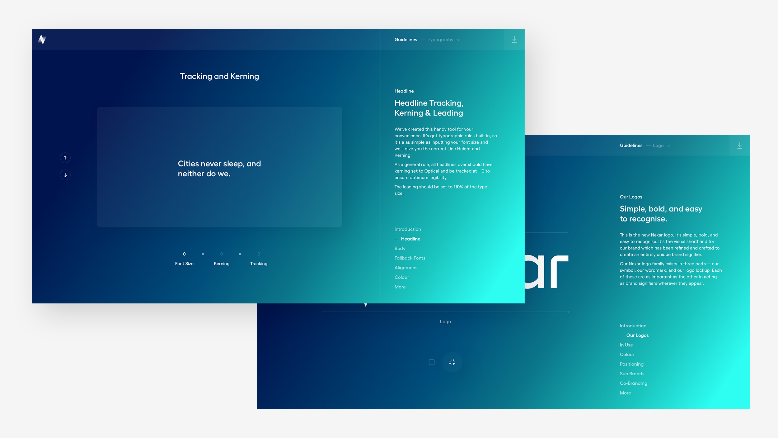
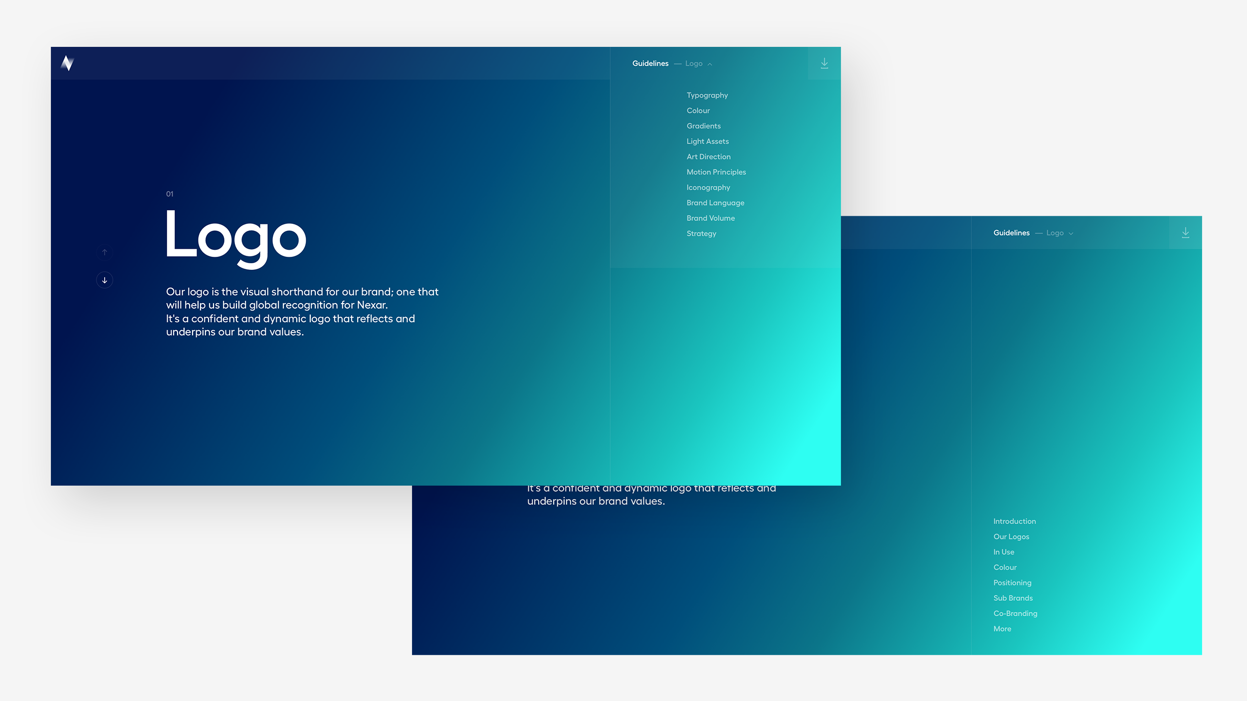
Users could either scroll down through the site and cycle through the guidelines in a linear fashion, or jump to a specific section.
Each section of a brand element contains 'chapters' that communicate a different guideline on how to use the specific asset. Within each chapter, users would usually have 1 or 2 pages that show variations and examples, to expand on the guidelines.
Next Project